Breaking Wave as Baptismal Image

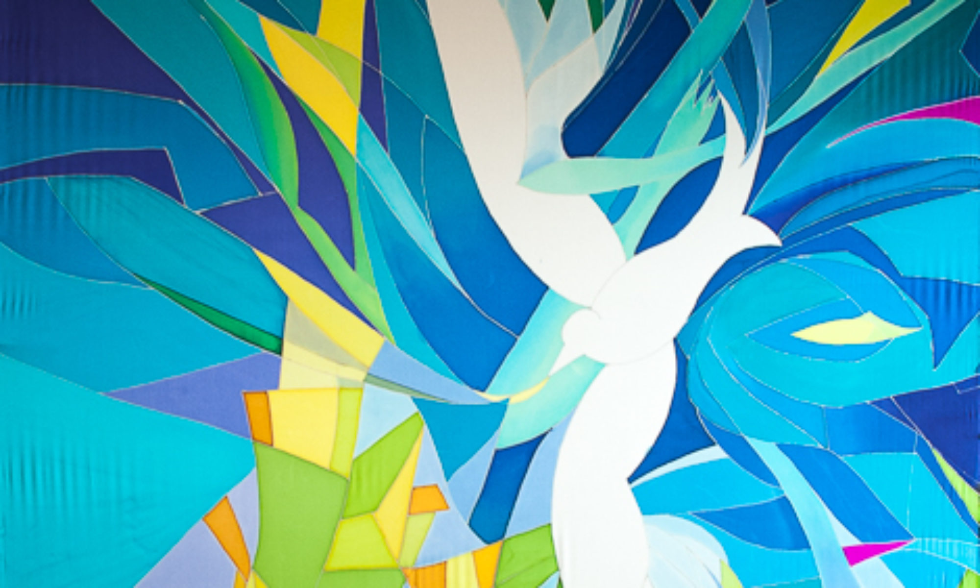
Commission for a Seaside Church

©2014 Kristen Gilje Breaking Wave
©2014 Kristen Gilje Breaking Wave, 8 feet by 55 inches, silk dye on silk.

I painted this 8 foot by 54 inch banner, for a church in Manasquan NJ,  immediately after finishing “Zion’s Waterfall.” I had enjoyed being very loose with the dyes, letting them mix and make textures without much control at all, using hardly any resist. In “Breaking Wave” I wanted to preserve the free and uncontrolled feeling with a different technique: painting with wax. This involved using the resist, which usually I use to control the dye, in a free and easy way. I bought 5 different sizes and shapes of brushes to make varying textures and painterly wax marks on the silk.

The process was similar to making a layered print. The very first wax marks preserved the white of the silk, only where I wanted highlights. Next I put a light layer of blues over the whole piece. After that dried, I put another layer of wax only where I wanted this light blue preserved….then a darker blue, and more wax, until I had all the color values I wanted on the finished piece, from lightest to darkest.

The original idea for this piece came from the pastor who commissioned it. Her congregation had been devastated by Hurricane Sandy in 2012, and her idea was to  make a Hurricane Sandy Baptismal Banner. The idea was an intriguing challenge. I love to connect natural images with sacred rite and ritual. After researching photos of the devastation on the web, I came up with the following image. However, I could not find any hope in the subject at all, no sense of the holy.

©2014 Kristen GiljeHurricane Sandy
©2014 Kristen Gilje Sketch for Hurricane Sandy Baptismal Banner

Even though this piece was more about the destructive forces of nature than the transforming sacred power of baptism, the commissioning pastor liked it.  I also had gotten quite attached to the idea of making this piece, not because it represented baptism, but instead the awesome and fierce power of nature, and the challenge of making it. NOT the intended goal…

The idea was to somehow lift the tragedy of Hurricane Sandy into the hands of God, recognizing the sacred water of baptism even in the terrifying walls of water in the storm. This was definitely too fresh a catastrophe for the idea to work. And the image represents “My God, why have you forsaken us?” better than baptism.  We realized that this image was not what her people needed, and changed course.

 Challenging art needs to be appropriate for the congregation it serves, and needs especially a person to facilitate discussion around the art, to lead people into challenging ideas with purpose. The purpose is not the art, but the idea.  And the idea must be carefully chosen. The art is a tool for thinking about the challenging idea.

The pastor knows their congregation and what they need the most, and how great or small a challenge they need, and most importantly what they need challenging on.

 We turned instead to an image more familiar and less challenging but still powerful: A wave breaking over rocks. I could indeed find the Holy here in the awesome power of water to transform even a rock, but also to nurture life and bring joy. It is a good image of the transforming power of baptism.

Here are pictures of my own exploration of a wave….first on newsprint 9 feet by 55 inches just learning shapes and values.

2014 Kristen Gilje

next a “map” simplified version, Still got carried away by the detail. I put this one under the silk to help me place the dye and wax.

2014 Kristen Gilje

This wax process was new for me…it was fun to have the WAX make the mark, rather than the dye.

My driving emotion for this piece is awe of the sacred in nature, despair in its failure, and hope/faith for change.This is now in a New Jersey church, as a symbol of the transformative power of the waters of baptism.


Zion’s Waterfall 3/4 done

Unrolling the Silk to See the Whole Painting

Working on a project that is 36 feet long when you only see 9 feet at a time can be tricky. I’m working on 3 wooden frames that have rollers on each end, so when I’m done with the first 9 feet I roll the fabric down to the next 9 feet.

©2013 Gilje "Zion's Waterfall" det. 3/4 finished
©2013 Gilje “Zion’s Waterfall” detail, 3/4 finished

Today I got a chance to roll it all out, all three panels side by side, on a big floor at a school so I can see it all at once. This is the only way to check on how it’s going and what changes still need to be made.

Zion's Waterfall Right side up
Zion’s Waterfall, 36 feet x 8 feet, silk dye on silk, 3/4 finished

It’s hard to get a good picture of something so large. In both of these pictures you can see that the perspective is foreshortened, so it is hard to see the whole thing properly. Even when the panels are hanging vertically on the wall where they belong it will be challenging to get a good photo.  Guess you will just have to see it in person!

©2013 Gilje "Zion's Waterfall" det. 3/4 finished
Upside down “Zion’s Waterfall, 36 feet by 8 feet, silk dye on silk, 3/4 finished.

See how different it looks upside down? The white area will be the very top of the painting. The piano is at the bottom of the piece.

In the next picture you see the very top of the piece, and I’ve selected some shots that take you down the whole length, so as you scroll down you can see some more of the detail. Remember that it’s not finished yet…this view of the whole  has left me with a list of things to take care of.

©2013 Gilje "Zion's Waterfall" det. 3/4 finished
Top of painting


©2013 Gilje "Zion's Waterfall" det. 3/4 finished

The area in the picture below is where I will be doing the most touch-up work, as far as fixing things go. This area needs some simplification and unification. I have a plan (check back to see how I do this).

xzions-waterfall-3-4-finished

Below you can see that the rocks, and the waterfall below the rocks, are the least developed of the project, since I am working from the top down.

©2013 Gilje "Zion's Waterfall" det. 3/4 finished

Can you see that the colors and textures are not as rich in the lower areas? It’s amazing what just one more layer of dye will do, to add variation and saturation. The rocks will be darker in value, maybe as dark as black, but I want to keep some of the color variation in these rock shapes.

©2013 Gilje "Zion's Waterfall" det. 3/4 finished

©2013 Gilje "Zion's Waterfall" det. 3/4 finished
Detail, Zion’s River

And the water in the lower waterfalls will be rich too, with more interesting lines and textures, sort of like what you see below.

I really like making good use of what the dyes can do. It’s a matter of knowing your materials very well, and what happens to them in different circumstances. I’ve used layered dyes to make interesting  lines, painted with water to push the paint around, used a watercolor technique of transparency, and blended colors to make soft edges. I’ve used some gutta resist for sharp edges and keeping one section of dye from another, lots of salt, and lots of prayer.

And finally, here I am in my studio-to-be, with the silk on the frames.   Now that all the silk is covered at least once the major decisions are done and the great share of the work is over. Now comes the very most important part of the painting: Tuning it up to make it just right.

Kristen in studio with Waterfall