A Challanging Color Scheme

New Banner for PA Senior Home

The chapel at Artman Senior Home has a bright burgandy carpet and white walls.  The paraments that decorate the alter are changed seasonally, with a different color for each season. When I looked at pictures of the chapel with the old banner in place it seemed we could do more to integrate the seasonal colors of red, purple, blue, green, white and gold into the space by designing with a new color scheme to incorporate each seasonal color in a better way than before.

©2013 Kristen Gilje, Silk dye on silk, 6'6" X 4'6" for Artman Home, Ambler, PA
©2013 Kristen Gilje, Rejoice in the Lord, silk dye on silk, 6’6″ X 4’6″ for Artman Home, Ambler, PA

The chapel at Artman Senior Home has a bright burgandy carpet and white walls.  The paraments that decorate the alter are changed seasonally, with a different color for each season. When I looked at pictures of the chapel with the old banner in place it seemed we could do more to integrate the seasonal colors of red, purple, blue, green, white and gold into the space by designing with a new color scheme to incorporate each seasonal color in a better way.

rejoice-old-banner
Artman Chapel with old banner

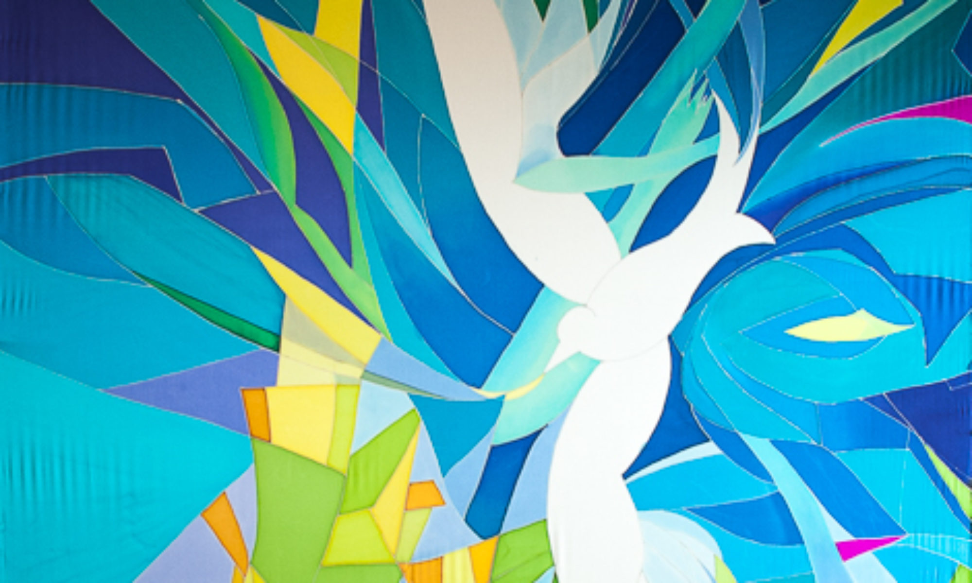
I purposely put all the traditional seasonal colors of the Christian church into this design, so that in any season the paraments would find an echo in the banner. Look closely and you will see that green, blue,  purple, red, white, and gold are all included in this painting. And of course we could not forget the burgandy of the carpet!

©2013 Kristen Gilje, Rejoice in the Lord, Silk dye on silk, 6'6
©2013 Kristen Gilje, Rejoice in the Lord, Silk dye on silk, 6’6

It took me quite a while to figure out how to do this. But I remembered a design I made for a stained glass window, installed in North Seattle, that I had always wanted to re-do in silk. It had a yellow-green base color. Yellow-green is the complementary color to magenta (close to the burgandy color) so I chose to go with that same color scheme: Yellow-green, magenta, gold. and I threw in some  cerulean blue for good measure. I think it worked!

Of course I have to give credit to friend and calligrapher Laura Norton,  Bellingham WA, for designing the beautiful lettering that I painted on the silk. You can reach her at [email protected].


Preparing for a Large Project

Waterfall Color Studies

The more preparation a person does before a big project, the greater confidence one has in what might happen when the color hits the ground.

This project will be 36 feet by 8 feet, silk dye on silk, of a waterfall. The design is monochromatic, that is, mostly blues and very little else, so I will have to depend to a great degree on value (lightness and darkness) to carry the piece. I also ordered some new colors of  dye, so I had plenty of nice rich blues to work with.

©2013 Kristen Gilje color studies for Waterfall

Since I ordered new blue dyes that I’ve never used before I wanted to see how they react with the dyes I already have, so I made a new color chart that includes the new dyes. Now I know what a color mixed with any other  dye will look like. On the right you can see the watercolor pigments I used to make the watercolor sketch I am using for the silk painting. It is these colors I wanted to find equivalent dyes for.

©2013 Kristen Gilje color studies for Waterfall

Above is the watercolor sketch of the waterfall, turned on its side. Look carefully to see the gridding on the sketch. Each line represents one foot. The waterfall will be 36 feet long, in three pieces: one 4 feet wide, and two 2 feet wide. You can see the long pen lines marking where the sketch is divided into 3 parts, wider in the middle and narrow on each side. Hanging below the sketch is my chosen palette! The color scheme is simple, with blues from light to dark, and from greenish to more purple-ish. Then I added in the complement of blue, orange, in an earthy tone, both lighter and darker. And also a black to punch up the value, if needed.

Kristen Gilje Zion's Waterfall2 wc sketch

Here above is the waterfall sketch, with a grid on tracing paper that I can lay over the sketch. It is carefully drawn to size, so I know how wide each panel will be, where the beam in the ceiling will intersect with the silk, and how high the 12′ slit in the bottom will be on the design. Why the slit? To pull back each side like curtains to reveal an immersion baptismal pool!

©2013 Kristen Gilje silk on frames for waterfall

My husband made me these wonderful frames to stretch the silk on for painting. You can see two narrower 2′ wide frames and one 4′ frame in the center, with silk stretched on them. He made rollers on each end of the frames, so I can work on just 9 feet of the 36-foot length of silk at once. I marked each foot of each piece of silk, so I can paint them side by side, knowing I’m in the right area.

Also note my wonderful studio, which is being built on weekends. Soon there will be an arched window overlooking the bay, and an opening skylight. We put in a floor and a staircase to get to the attic last fall, insulated this spring, and this coming fall we will put up dry wall and paint the walls white. The distance from the floor to the peak is 11 feet! It’s a wonderful place to work.

Keep an eye on this blog. I’ll be taking you through this whole process as it progresses. Also see the previous entries to get the full story on this project!


2013 Grunewald Guild Liturgical Arts Weeks

 “At the Meeting of Heaven and Earth”

Grunewald Guild, Leavenworth, WA, August 5-11, August 12-18, 2013

Teaching Liturgical Arts Week at Grunewald Guild with Jan Richardson, Garrison Doles, Gilly Sakakini and Laurie Clark every summer is a treat. I love the way our classes are woven together by Jan’s words and Gary’s music, and often find myself dreaming at night about the magic that will happen between us all the next day. This is indeed a thin place, where we all come together to explore Spirit in, with, through, around, under and above us.

Here’s what Jan has written about our theme “Between Heaven and Earth”:

“In the physical landscape and in the turning of the year, there are places where the veil between worlds becomes permeable. Past and future come together in the present, and heaven and earth meet. It’s not that God is somehow more present in those places—“thin places,” as Celtic folk have called them; rather, something in those places and times invites us to become more present to the God who is always with us. A veil falls away within us. We open, and we see.

Join us as we enter and explore these thin places, the spaces that open before us as we engage in worship, in our communities, and in our daily lives.”

Silk Painting: Exploring Color and Line as a Thin Place

I will be teaching two weeks of silk painting classes during this time, with one building on the other. In Week I everyone is invited, beginners through advanced. During Week II former silk painting students of mine (including Week I students) are invited for more in depth exploration. For more info, visit Liturgical Arts Week on the Guild’s website.

Full information & registration for Week I Silk Painting, August 5-11

Full information & registration for Week II Silk Painting, August 12-18

See you AT THE MEETING OF HEAVEN + EARTH