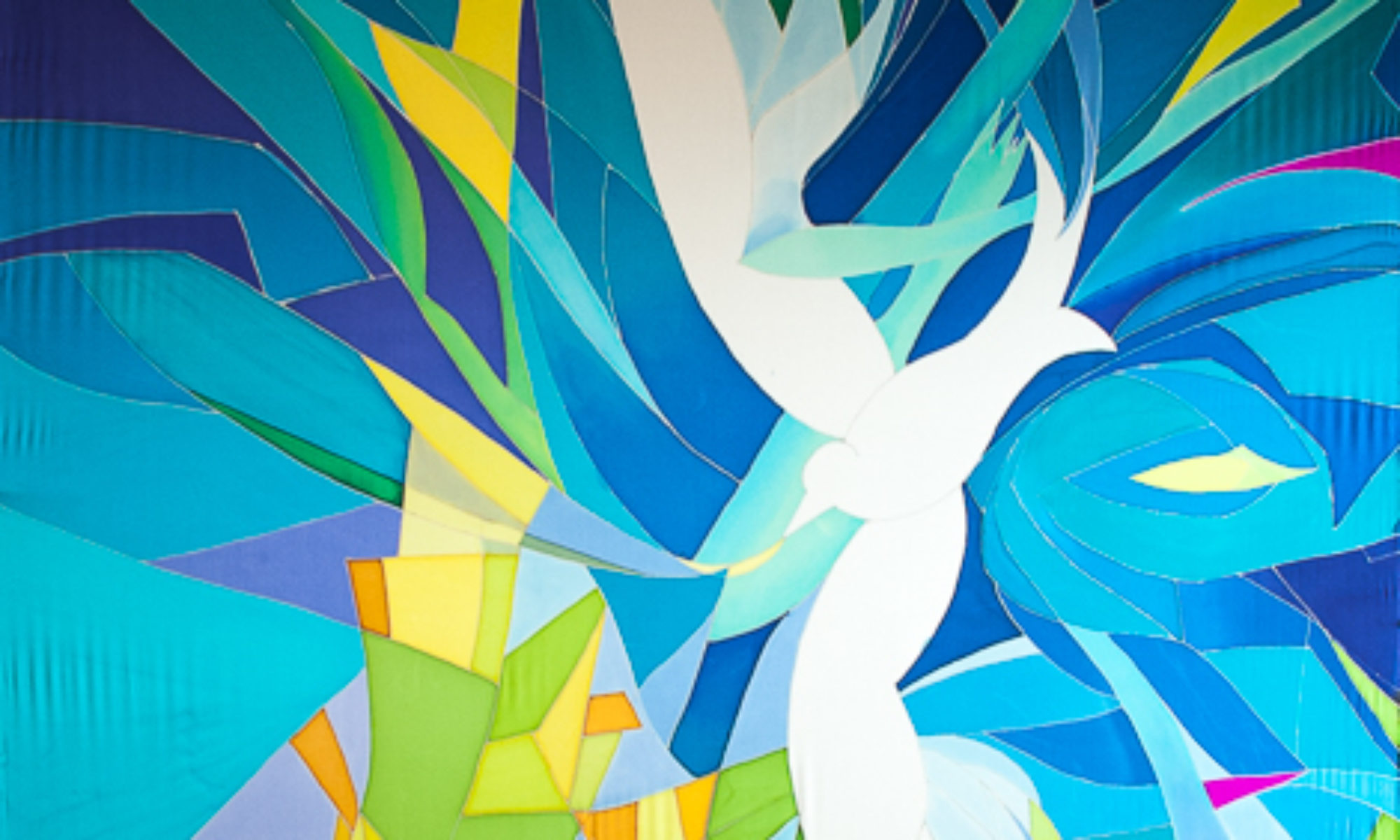
St. Mark’s Lutheran Church by the Narrows (Tacoma, WA) has lots of beautiful art in its sanctuary, including some great stained glass windows. My friend Janet pointed out her favorite part of the glass, a symbol of a dove. She asked me if I could make her a Deacon’s stole with this design on it, transposing the blues to red instead.
Stained glass at St. Marks by the Narrows, Tacoma, WA Det.
Transposing the colors from blue to red, in watercolor
To the left is a photo of the stained glass, which is about 12 feet high, and on the right is my watercolor rendition of the design in reds. I chose to add some purples and spring greens for spark.
Janet’s St. Mark’s Deacon Stole
Janet’s St. Mark’s Dove stole modeled by a Bellingham friend.
The next step was to use my red interpretation on a deacon’s stole pattern that I designed several years ago. I found two  asymmetrical black buttons in a fancy knitting store to help strengthen the joint between the two sides.  Can you see them?
I like how the blues and greens and dark black-reds add just enough contrast to the overall red.
Janet’s stole modeled by a friend here in Bellingham, showing the side view. Thanks Sharry!
The Ephesian 3 text was chosen by St. Marks Lutheran Church by the Narrows, Tacoma WA for their 60th anniversary. This letter from Paul talks in part about the cosmic nature of God and paradoxically how God is also present with us in our earth-bound existence.
I chose a tree to represent the union of the vast, cosmic nature of God and the earthly nature of our local lives in community.  This tree is a version of the tree of life, an archetype that spreads throughout human culture. A tree reaches towards the sky and onwards towards the planets, while being rooted firmly in the ground. It is a reminder that we are indeed connected to the world and universe outside our daily and earthly routines, even though we often forget. Here it represents both the wood of the cross alive, and Christ as connecter of heaven to earth.
In my first sketch for this design I made the tree stretch tall and strong, up to the planets. And I made a tap root that stretched down, down, deep within the earth and anchored by subterranean rocks. I sent this design off to the commissioning pastor, who wrote back asking me to please put a few more trees in the composition.
This pastor grew up on the coast. He knew that trees growing on the western coast of North America don’t have deep roots; they have shallow roots. And they grow in groves. The shallow roots of the trees intertwine with one another to support each other. A shallow-rooted tree growing alone would get toppled by coastal winter storms, but a grove of trees with an intertwining root mass can withstand all nature can throw at them.
So I put some more trees in, made the roots more horizontal and intertwining.
The houses under the central tree represent our human community, specifically the community of this particular congregation. Our relationships are like roots that reach out to one another in community, and hopefully out even further to support those considered outside of our community, to support them too.
And finally, the vast quantities of water that make the Northwest so great in this piece also represent the water of life in Rev. 22, flowing from the throne of God, nurturing the tree of life which bears good fruit for all. My prayer is that this same Spirit of God, present in, with and through all things will nurture our communities with all its relationships, humankind and other, so that we bear good fruit for the sake of all humanity and all the earth.
I painted this 8 foot by 54 inch banner, for a church in Manasquan NJ, immediately after finishing “Zion’s Waterfall.” I had enjoyed being very loose with the dyes, letting them mix and make textures without much control at all, using hardly any resist. In “Breaking Wave” I wanted to preserve the free and uncontrolled feeling with a different technique: painting with wax. This involved using the resist, which usually I use to control the dye, in a free and easy way. I bought 5 different sizes and shapes of brushes to make varying textures and painterly wax marks on the silk.
The process was similar to making a layered print. The very first wax marks preserved the white of the silk, only where I wanted highlights. Next I put a light layer of blues over the whole piece. After that dried, I put another layer of wax only where I wanted this light blue preserved….then a darker blue, and more wax, until I had all the color values I wanted on the finished piece, from lightest to darkest.
The original idea for this piece came from the pastor who commissioned it. Her congregation had been devastated by Hurricane Sandy in 2012, and her idea was to make a Hurricane Sandy Baptismal Banner. The idea was an intriguing challenge. I love to connect natural images with sacred rite and ritual. After researching photos of the devastation on the web, I came up with the following image. However, I could not find any hope in the subject at all, no sense of the holy.
Even though this piece was more about the destructive forces of nature than the transforming sacred power of baptism, the commissioning pastor liked it. I also had gotten quite attached to the idea of making this piece, not because it represented baptism, but instead the awesome and fierce power of nature, and the challenge of making it. NOT the intended goal…
The idea was to somehow lift the tragedy of Hurricane Sandy into the hands of God, recognizing the sacred water of baptism even in the terrifying walls of water in the storm. This was definitely too fresh a catastrophe for the idea to work. And the image represents “My God, why have you forsaken us?” better than baptism. We realized that this image was not what her people needed, and changed course.
 Challenging art needs to be appropriate for the congregation it serves, and needs especially a person to facilitate discussion around the art, to lead people into challenging ideas with purpose. The purpose is not the art, but the idea. And the idea must be carefully chosen. The art is a tool for thinking about the challenging idea.
The pastor knows their congregation and what they need the most, and how great or small a challenge they need, and most importantly what they need challenging on.
 We turned instead to an image more familiar and less challenging but still powerful: A wave breaking over rocks. I could indeed find the Holy here in the awesome power of water to transform even a rock, but also to nurture life and bring joy. It is a good image of the transforming power of baptism.
Here are pictures of my own exploration of a wave….first on newsprint 9 feet by 55 inches just learning shapes and values.
next a “map” simplified version, Still got carried away by the detail. I put this one under the silk to help me place the dye and wax.
This wax process was new for me…it was fun to have the WAX make the mark, rather than the dye.
My driving emotion for this piece is awe of the sacred in nature, despair in its failure, and hope/faith for change.This is now in a New Jersey church, as a symbol of the transformative power of the waters of baptism.
This large 3-panel banner which I call a silk mural, was hung this winter, and really makes a presence as you walk into the sanctuary. It is 36 feet long and 8 feet wide. My task was to design “an abstract waterfall”, leaving room for interpretation.
The wall behind and around this silk mural was painted a medium dark brown to echo some of the rock colors, and to help enhance their videos. Apparently darker colors are better than light ones for this.
This church pushed me in a very positive way, from my comfort level of more representational art to more abstract work. I chose a very limited pallet of blues, with a bit of the complementary dark orange/browns, used value (lights and darks) to drive the design, and really let the silk dye do the work itself instead of controlling it with a lot of detail.
Originally the mural was designed so the cross would hang two-thirds of the way up the banner. This would be on the lower part of the dark stream coming down from the top, and above the white waterfall streams that are hitting the rocks. I hope someday they will do this, but we’ll see. When an artist makes a piece it’s a bit like bringing a child into the world: you have to let go when they leave home.
If you would like to follow the process of designing and making this project, scroll down to see 4 or 5 earlier posts about Zion’s Waterfall. You can see the project morphed quite a bit, before we settled on a final design.
It’s been a very busy summer, but the 36 foot by 8 foot abstract waterfall project is just about finished. This weekend I took the 3 silk panels back to the school gym floor and unrolled them to check finished size and appearance. I am very pleased with the final layers of dye, and think that the goal of a sense of “power” and “mystery” translates very well. I measured everything, and with cutting, rolling, painting, washing, steaming and shrinkage, the panels are very very close to the desired size. The center panel is one inch longer than the other two (difference in shrinkage), and when the panels are side by side with no gap they measure 8 feet by 6 inches exactly, top and bottom, which is what we were shooting for.
The picture below shows the scale of this project, when you see the piano in the upper right hand corner.
I have hemmed the 216 feet of the side edges of the panels, and am about to make the 12 foot slit in the center panel so it can open for the immersion baptismal pool behind the panels. Then I’ll take the 4’x 15″ rectangle out of the top middle of the center panel to make room for the beam in the ceiling, then hem both of those.
Also, all the tops of the silk panels will have sleeves for a rod, to be hung either from the wall or from the underside of the beam. I will lastly put sleeves in the bottom of all the panels in casewe want to run a rod through those too, for stabilizing.
To see full pictures, click on one of the thumbnails below.
Using stovepipe and propane burners to steam-set silk dyes
Once the silk dye has been applied to the silk, the dyes need to be steam-set to bond permanently with the fabric. Before steaming water can wash most of the dye from the silk, but after steaming water will not hurt the silk painting. The painting becomes permanent. (Except for direct sunlight! In direct sunlight the silk painting will fade. Indirect sunlight is fine.)
Here you can see the set-up I use to steam my silk. I am steaming “Zion’s Waterfall”, which consists of three silk panels: two are 37 feet by 28 inches, and one is 37 feet by 52 inches. The widest panel is being steamed in the tallest stovepipe, and one of the narrower panels is in the shorter stovepipe.
You can see the silk painting in different stages in earlier posts by clicking on the following:
To steam the silk it is first rolled up in newsprint and brown wrapping paper, making sure there is room on the top of the roll to drill a hole through the top inch. I stick this paper/silk roll inside the stovepipe, then thread a wire through holes in the top of the stovepipe and the drilled hole through the paper roll. Now the stovepipe can be upended, with the paper roll hanging from the wire inside the stovepipe.
Next I stick the whole affair into a hotel-sized pot on a propane burner, fill the pot with water, seal the space between pot and pipe with aluminum foil crimped under the rim of the pot and taped with masking tape to the pipe, so there are no holes for steam to escape. I light the burner, and let the water boil and make steam for 3-5 hours, depending on how thick my roll is. Oh yes, the lid on top of the pipe is 1-2 inches of New York Times papers, procured from local co-op’s recycle bin, secured with masking tape to the top of stovepipe. Somehow it all works! I can tell if the steaming is successful in two ways: that the colors are more intense than before steaming, and when hand-washing (next step after steaming) that clouds of excess dye do not wash out of the silk, but just a little bit of dye that is not bonded to the silk.
If you want to do this process yourself there are more details to know for success. For now I can suggest Susan Louise Moyer’s book “Silk Painting” where you will find complete directions. I’ll write complete instructions later this summer for those interested.
The chapel at Artman Senior Home has a bright burgandy carpet and white walls. The paraments that decorate the alter are changed seasonally, with a different color for each season. When I looked at pictures of the chapel with the old banner in place it seemed we could do more to integrate the seasonal colors of red, purple, blue, green, white and gold into the space by designing with a new color scheme to incorporate each seasonal color in a better way than before.
The chapel at Artman Senior Home has a bright burgandy carpet and white walls. The paraments that decorate the alter are changed seasonally, with a different color for each season. When I looked at pictures of the chapel with the old banner in place it seemed we could do more to integrate the seasonal colors of red, purple, blue, green, white and gold into the space by designing with a new color scheme to incorporate each seasonal color in a better way.
Artman Chapel with old banner
I purposely put all the traditional seasonal colors of the Christian church into this design, so that in any season the paraments would find an echo in the banner. Look closely and you will see that green, blue, purple, red, white, and gold are all included in this painting. And of course we could not forget the burgandy of the carpet!
It took me quite a while to figure out how to do this. But I remembered a design I made for a stained glass window, installed in North Seattle, that I had always wanted to re-do in silk. It had a yellow-green base color. Yellow-green is the complementary color to magenta (close to the burgandy color) so I chose to go with that same color scheme: Yellow-green, magenta, gold. and I threw in some cerulean blue for good measure. I think it worked!
Of course I have to give credit to friend and calligrapher Laura Norton, Bellingham WA, for designing the beautiful lettering that I painted on the silk. You can reach her at [email protected].
Working on a project that is 36 feet long when you only see 9 feet at a time can be tricky. I’m working on 3 wooden frames that have rollers on each end, so when I’m done with the first 9 feet I roll the fabric down to the next 9 feet.
Today I got a chance to roll it all out, all three panels side by side, on a big floor at a school so I can see it all at once. This is the only way to check on how it’s going and what changes still need to be made.
Zion’s Waterfall, 36 feet x 8 feet, silk dye on silk, 3/4 finished
It’s hard to get a good picture of something so large. In both of these pictures you can see that the perspective is foreshortened, so it is hard to see the whole thing properly. Even when the panels are hanging vertically on the wall where they belong it will be challenging to get a good photo. Guess you will just have to see it in person!
Upside down “Zion’s Waterfall, 36 feet by 8 feet, silk dye on silk, 3/4 finished.
See how different it looks upside down? The white area will be the very top of the painting. The piano is at the bottom of the piece.
In the next picture you see the very top of the piece, and I’ve selected some shots that take you down the whole length, so as you scroll down you can see some more of the detail. Remember that it’s not finished yet…this view of the whole has left me with a list of things to take care of.
Top of painting
The area in the picture below is where I will be doing the most touch-up work, as far as fixing things go. This area needs some simplification and unification. I have a plan (check back to see how I do this).
Below you can see that the rocks, and the waterfall below the rocks, are the least developed of the project, since I am working from the top down.
Can you see that the colors and textures are not as rich in the lower areas? It’s amazing what just one more layer of dye will do, to add variation and saturation. The rocks will be darker in value, maybe as dark as black, but I want to keep some of the color variation in these rock shapes.
Detail, Zion’s River
And the water in the lower waterfalls will be rich too, with more interesting lines and textures, sort of like what you see below.
I really like making good use of what the dyes can do. It’s a matter of knowing your materials very well, and what happens to them in different circumstances. I’ve used layered dyes to make interesting lines, painted with water to push the paint around, used a watercolor technique of transparency, and blended colors to make soft edges. I’ve used some gutta resist for sharp edges and keeping one section of dye from another, lots of salt, and lots of prayer.
And finally, here I am in my studio-to-be, with the silk on the frames.  Now that all the silk is covered at least once the major decisions are done and the great share of the work is over. Now comes the very most important part of the painting: Tuning it up to make it just right.
The more preparation a person does before a big project, the greater confidence one has in what might happen when the color hits the ground.
This project will be 36 feet by 8 feet, silk dye on silk, of a waterfall. The design is monochromatic, that is, mostly blues and very little else, so I will have to depend to a great degree on value (lightness and darkness) to carry the piece. I also ordered some new colors of dye, so I had plenty of nice rich blues to work with.
Since I ordered new blue dyes that I’ve never used before I wanted to see how they react with the dyes I already have, so I made a new color chart that includes the new dyes. Now I know what a color mixed with any other dye will look like. On the right you can see the watercolor pigments I used to make the watercolor sketch I am using for the silk painting. It is these colors I wanted to find equivalent dyes for.
Above is the watercolor sketch of the waterfall, turned on its side. Look carefully to see the gridding on the sketch. Each line represents one foot. The waterfall will be 36 feet long, in three pieces: one 4 feet wide, and two 2 feet wide. You can see the long pen lines marking where the sketch is divided into 3 parts, wider in the middle and narrow on each side. Hanging below the sketch is my chosen palette! The color scheme is simple, with blues from light to dark, and from greenish to more purple-ish. Then I added in the complement of blue, orange, in an earthy tone, both lighter and darker. And also a black to punch up the value, if needed.
Here above is the waterfall sketch, with a grid on tracing paper that I can lay over the sketch. It is carefully drawn to size, so I know how wide each panel will be, where the beam in the ceiling will intersect with the silk, and how high the 12′ slit in the bottom will be on the design. Why the slit? To pull back each side like curtains to reveal an immersion baptismal pool!
My husband made me these wonderful frames to stretch the silk on for painting. You can see two narrower 2′ wide frames and one 4′ frame in the center, with silk stretched on them. He made rollers on each end of the frames, so I can work on just 9 feet of the 36-foot length of silk at once. I marked each foot of each piece of silk, so I can paint them side by side, knowing I’m in the right area.
Also note my wonderful studio, which is being built on weekends. Soon there will be an arched window overlooking the bay, and an opening skylight. We put in a floor and a staircase to get to the attic last fall, insulated this spring, and this coming fall we will put up dry wall and paint the walls white. The distance from the floor to the peak is 11 feet! It’s a wonderful place to work.
Keep an eye on this blog. I’ll be taking you through this whole process as it progresses. Also see the previous entries to get the full story on this project!
A few weeks ago I introduced you to a current project and promised to keep you in the loop as it develops (see earlier post). The theme for this project is a vision from Ezekiel 47 (and repeated in Revelation 22), of the river of the water of life, flowing from the throne of God, bringing healing, wholeness and life to all. We are starting with a 30 foot long painting of a waterfall.
This is a congregation of immersion baptism, and a baptismal pool will be behind this waterfall. !!! For a baptism, the lower 12 feet of the banner will be drawn to each side, like curtains, to expose the pool and the drama of the baptism.
I like how the vertical water, flowing from the throne of God, is powerful and mysterious. This congregation has pushed me into a more abstract interpretation of “waterfall”…my painting tends towards realism when I work with landscape. As you can see below and to the right, which is my first attempt at the design.
When I brought this first and more realistic design into the sanctuary and we imagined it 30 feet tall it became readily apparent that the image would be overpowering. It’s a nice little sketch, but that white cone of a waterfall is just too strong, and too literal. “No scope for the imagination” as Ann of Green Gables would say. Just like a good poem, you don’t want to say it all, but instead leave room for the text to work, for instance, or the Spirit.
My clients, a pastor and a worship leader, asked for more abstraction, so I went home and tried my hand at it. I actually did about 6 of these, trying to make it work. But they all ended up pretty wimpy looking.
Sound panel sketch, 3rd down from the top in the waterfall. Can you find it there?
In the end, not happy with any of the second batch, I went back to a sketch originally for the 26 sound panels that are to be covered with silk also (more on this later). I put those together and turned them vertically. It worked! Powerful, majestic and magical, in my humble estimation.
This original design simply “came” to me, for the sound panels. If you look back at the first picture, you can see the waterfall is made up of several horizontal pieces of paper. The one shown to the left here is the 3rd panel from the top, in the waterfall. Can you find it? Each of these pieces is to potentially be a covering for the 26 sound panels, 8′ x 4′ each, that surround the walls of the sanctuary. We shall see if the project continues into this chapter. For now, it’s enough to make this big waterfall!
In the next days I’ll post pictures of what it looks like in my studio when I actually start making these. As you can see, there’s a lot of planning that goes into the design process. It’s actually the hardest, and most important, step of the whole process.
Here’s the Ezekiel 47 text:
“Then he brought me back to the door of the temple, and behold, water was issuing from below the threshold of the temple toward the east (for the temple faced east). The water was flowing down from below the south end of the threshold of the temple, south of the altar.2 Then he brought me out by way of the north gate and led me around on the outside to the outer gate that faces toward the east; and behold, the water was trickling out on the south side.
3 Going on eastward with a measuring line in his hand, the man measured a thousand cubits,[a] and then led me through the water, and it was ankle-deep.4 Again he measured a thousand, and led me through the water, and it was knee-deep. Again he measured a thousand, and led me through the water, and it was waist-deep. 5 Again he measured a thousand, and it was a river that I could not pass through, for the water had risen. It was deep enough to swim in, a river that could not be passed through. 6 And he said to me, “Son of man, have you seen this?â€
Then he led me back to the bank of the river.7 As I went back, I saw on the bank of the river very many trees on the one side and on the other. 8 And he said to me, “This water flows toward the eastern region and goes down into the Arabah, and enters the sea;[b] when the water flows into the sea, the water will become fresh.[c]9 And wherever the river goes,[d] every living creature that swarms will live, and there will be very many fish. For this water goes there, that the waters of the sea[e] may become fresh; so everything will live where the river goes. 10 Fishermen will stand beside the sea. From Engedi to Eneglaim it will be a place for the spreading of nets. Its fish will be of very many kinds, like the fish of the Great Sea.[f]11 But its swamps and marshes will not become fresh; they are to be left for salt. 12 And on the banks, on both sides of the river, there will grow all kinds of trees for food. Their leaves will not wither, nor their fruit fail, but they will bear fresh fruit every month, because the water for them flows from the sanctuary. Their fruit will be for food, and their leaves for healing.â€
“Isn’t that an awesome picture of the church? That the Spirit and Word of the Lord flows from the throne and gets deeper, providing sustenance and healing to all! ”


 This is a congregation of immersion baptism, and a baptismal pool will be behind this waterfall. !!! For a baptism, the lower 12 feet of the banner will be drawn to each side, like curtains, to expose the pool and the drama of the baptism.
