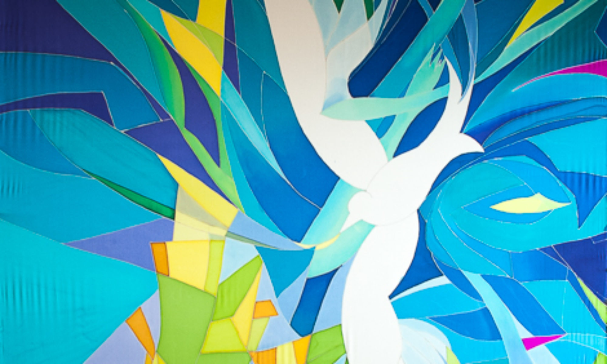
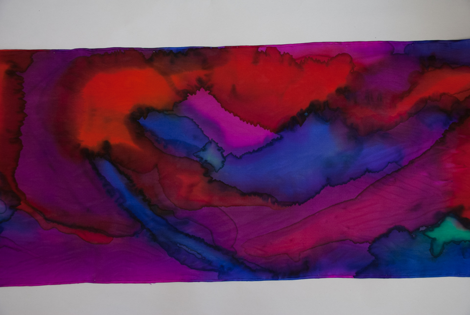
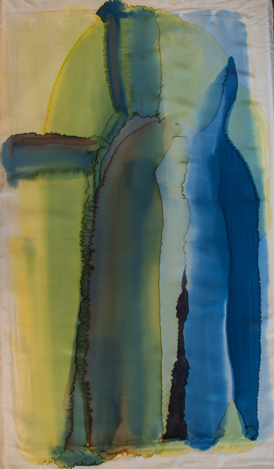
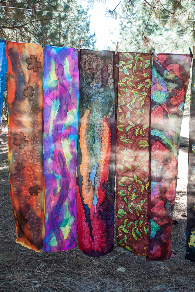
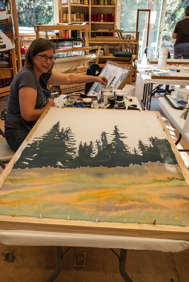
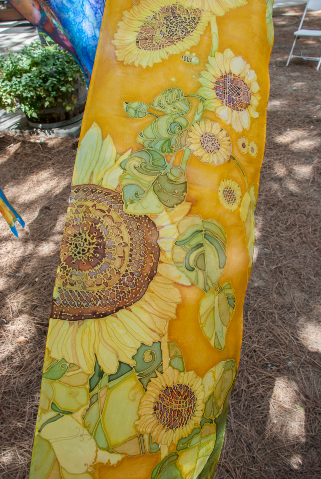
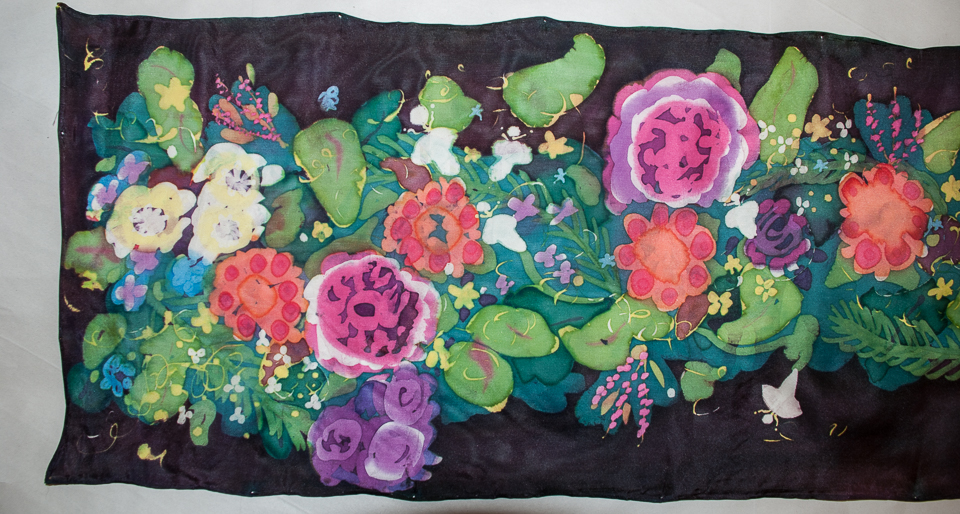
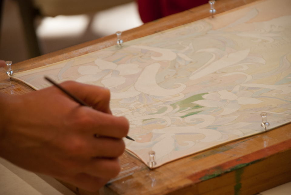
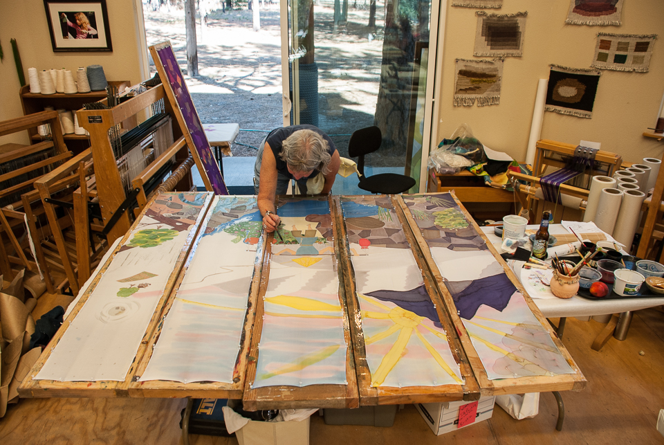
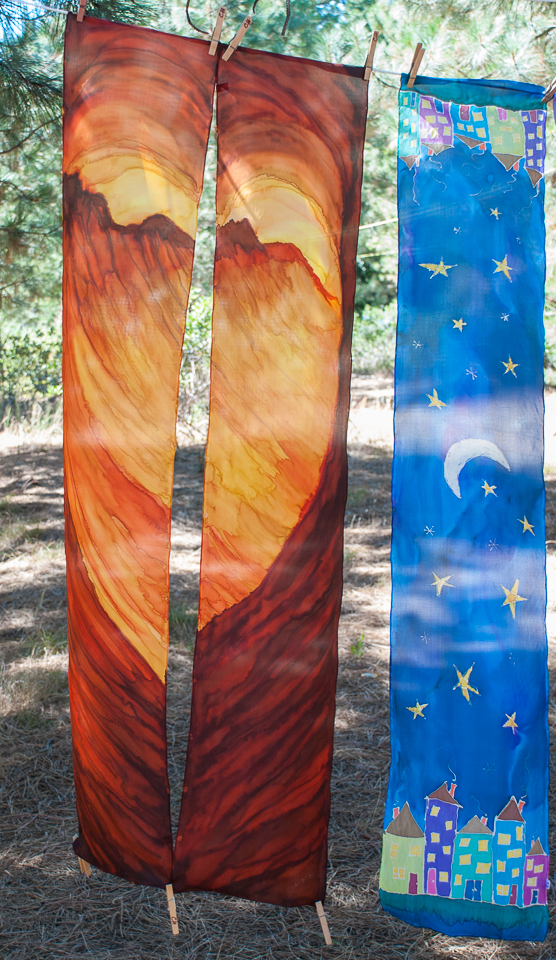
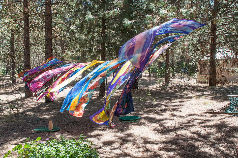
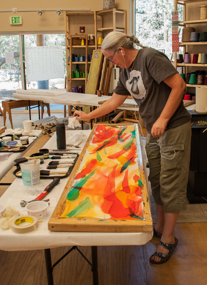
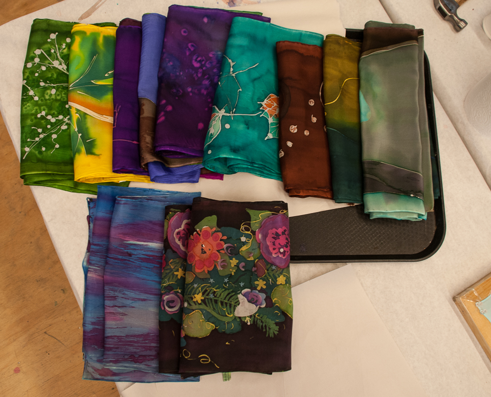
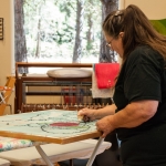
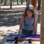
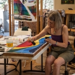
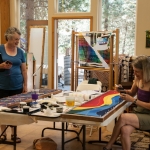
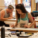
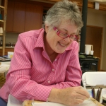
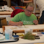
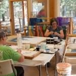
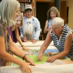
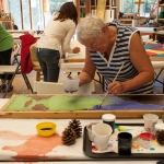
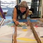
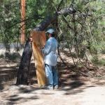
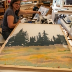
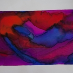
Last Sunday I returned from teaching a week long silk painting workshop at the Grunewald Guild, August 3-9 2015. Â We had a wonderful week with 11 students, many of those returning students and a few brand new silk painters. We all learned from each other, pushed our own boundaries, made wonderful friends, enjoyed someone else cooking for us, and saturated ourselves with color.
Our class, entitled Color in the Wild, focused on seeing color combinations that nature provides and learning about these combinations with the help of a color wheel. We talked about complementary, split complimentary, and triadic color schemes, use of neutrals, and dominance, to name a few color thinking structures.
Triadic color combos from nature
Each student was asked to choose a primary triadic “pallet” from colors they saw in nature, and reproduce it with the dyes we had available on the above grid.
You will see from the photos below how diverse each person’s work was. Whether a newby or a seasoned silk painter, I was very proud of the depth of challenge each person took on.
Lynn, a seasoned silk painter, pushes her limits.
Here are some pictures of the work we did last week. Be patient; it’s a slide show with 6 seconds in between pictures.
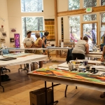
And here we are below, all working in the Fiber Arts Building.
One more tidbit for you: A short video that Susi Franco made for our class
We missed you Janell!!! , and all those unable to come. Hopefully you will be with us next year.
Thanks for a wonderful week everyone. Kristen
Instructor Kristen Gilje collecting items for color theory lesson
It’s been a long process, and now we are reaping the rewards of patience, focused work and group process. The silk mural “Tree of Life” is now installed and doing its job at Faith Lutheran Church, Bellingham, WA
Kristen Gilje’s “Tree of Life,” hand painted silk dye on silk, 25 feet by 8 feet
From Revelation 22
1 Then the angel showed me the river of the water of life, as clear as crystal, flowing from the throne of God and of the Lamb 2 down the middle of the great street of the city. On each side of the river stood the tree of life, bearing twelve crops of fruit, yielding its fruit every month. And the leaves of the tree are for the healing of the nations.
Faith Lutheran Church does a lot of work with those in need in the surrounding neighborhood. They have a beautiful and productive community vegetable garden, whose produce is served in meals to any who are hungry. They have several programs designed to serve people in pain and in need, and to welcome the outsider into the fold. In other words, they aspire to provide fruit that ripens twelve months of the year, and leaves for the healing of many in their midst. They are like a tree of life planted in the street of the city, and look to that image for inspiration and strength.
Last Sunday’s service included a dedication for these banners.  It was the first day on the job for this artwork. Colored light from the stained glass windows streaked across the banners illuminating the painting with a magical and ever-changing light. At times the light on the painting was almost overwhelming, then it changed in an instant to be more gentle, then the light fell on the wall a foot behind and between the two panels and onto the cross, and then raked across the space again in a new unpredictable way. The effect was one of impermanence and transparency, and of an external power influencing the piece. Theologically it was perfect, seen as the Light of God that illuminates and creates all.
What is not apparent from a frontal view as you enter the space is that the wooden cross actually hangs several feet in front of the silk, and the silk hangs about a foot from the wall. This allows for movement of the silk, and a three-dimentionality with the wall and the cross. When you approach the chancel from different directions you sense depth in what originally seems flat.
Here below is a picture from all the way back in the nave. I am pleased with how the painting fits in the the architectural space.
Thank you Pastor Sharon Swanson, assistant Jessie Twigg-Harris, and the congregation of Faith Lutheran Church for giving me the opportunity to do this work for you. My hope is that this artwork will do its job to acknowledge, uplift and inspire your already vibrant and growing mission to feed the hungry, to welcome the stranger, and to bring in the Reign of God here and now, right here in your Northwest Avenue neighborhood.
In the last post on this silk Tree of Life project for Faith Lutheran Church, Bellingham WA, I showed you how I transfer a 10″x10″ pen and ink design onto large paper to make a pattern 8 feet by 8 feet. This makes up only one third of our 24 foot long pattern. I transferred all the rest of the watercolor design to paper using a grid system since the pattern shapes are so large that they get distorted by the projector.
Putting the silk and pattern both on the frames is the next step. My husband made two rectangular frames out of straight 1x lumber, both 4 feet by 9 feet interior dimensions, and added legs. Then he rigged up a roller system, very much like a loom, so I could load the extra silk onto each end.
In the picture above you can see the silk loaded on one of the rollers, and the paper pattern beneath it. Under both the silk and the paper are hung clear acrylic panels that allow me to raise the paper pattern to the right height below the silk. It helps very much to put a shop light underneath the frame, which shines through the clear acrylic to show my magic marker lines from the pattern through the silk. I use a resist called “gutta” to draw the lines, following the pattern, using clear gutta in some places and black gutta in others. I am using black gutta to help the piece echo leaded stained glass of the Chartre Cathedral North Window.
In the foreground of this picture you can see the black magic marker pattern underneath the silk. In the background you can see part of my studio. It is in a re-modeled attic of our 120 yr old house.
Here is a view  the other direction:
I have divided the work on this project into three separate parts. First I am developing the mandala-like stained glass window design, as that is the central focus area with a lot of detail. Almost every other part of the design supports this section. Second I will develop the background sky and waterfall, down to the horizontal pool of water. This second section is all connected by muted and more neutral colors with soft edges. The colors will gradually change down to the waterfall area behind the foliage. Lastly I’ll work on the waterfall, the bottom third of the piece. This area will repeat blues, purples, greens and whites in the areas above, but also contain some of the darkest colors in the rocks. This area will include gradual blending of colors along with some hard edges, and maybe splattering or other techniques to represent flowing, falling and splashing water.
Lots of work must be done before laying in the first colors. But now that the gutta for the round folliage area is ready, I will begin the most fun part!
I am happiest with a paintbrush full of color.
It takes a lot of time to fill in all of those spaces, and this part will be only half-done until the background gets filled in.
Below you can see the ghost images of the fruit yet to be, with the blackberries coming along nicely.
I
Now to develop all 12 of the fruits that ripen one a month, so that none may go hungry!
Spring brings new life, and with it an exciting new Tree of Life project for me. I’m happy to be working with a local church, Faith Lutheran Church in Bellingham WA.
 Here’s the full view of the design. The finished piece will be 24 feet long and eight feet wide, on two long silk panels 4 feet across each.
The cross will not be painted in, but in this sketch represents the church’s existing wooden cross (9 feet by 6 feet) that hangs the ceiling. The silk mural will be behind the wooden cross.
I will use colors on the tree that echo the wood colors of the existing cross to make a metaphor: The Cross is like a tree that is alive, blooming, and abundant with food in each season, and its leaves are for the healing of the nations. (Rev. 22 vs 2)
Faith Lutheran Church has a big wall behind its alter that is blank except for the wooden cross and colored light coming from long thin windows at the side. Unfortunately I only have a black and white photo. The carpet is a muted purple, paraments at the time are olive green, the walls warm wood color. The wall looks like it needs a stained glass window behind its cross to me. So I designed the foliage of the tree with the underlying structure of the North Window of Chartres Cathedral in France. At times during the day light from the stained glass windows on the side will enliven the Tree of Life painting in a lovely way.
The collaborative process for designing this project was conducted  over a period of time, with input from a fairly large group of people from Faith Church. We met 3 or 4 times, and after each meeting I used their input to make changes in the design.
Below you can see the same sketch without the cross. This is the actual design that I will be painting on silk.
Things are going well. I just finished another couple projects and have cleared up my plate of tasks: so now it’s full steam ahead on this project. I’ve been anxious to get started and it’s really fun.
So far I’ve prepared the silk by hand-washing, line drying, ironing. Then cutting the width down to the right size and applying “fray-block” on all 50 feet of cut edge. The frames are all ready to receive both the pattern and the silk, and right now I’m finishing up drawing the pattern life-size on big paper after making a more careful drawing of the rose window/tree foliage.
UPDATE: April 8, The silk is now on the frames and I have been transferring the design to the silk with a resist from the rubber plant, called “gutta.” I will show pictures of this in the next post.
Following are some pictures of how I make this 30″ x 10″ watercolor sketch into a life-sized pattern for an eight-foot by 24-foot silk painting.
The first step was to refine the round Chartres foliage portion of the piece on another smaller drawing. I like this pen and ink version. It is 10″x10″.
The second step is to enlarge the whole sketch onto paper the same size as the silk would be. I use big roles of newsprint cut to the right size. Most often I use a projector to throw the image onto the paper, but with a round and highly geometrical pattern like this I had to transfer it the old fashion way. I made a big compass out of trammel points and measured carefully to get all the geometrical forms just right.
After this geometrical pattern is finished I can project the details from the pen and ink drawing onto the pattern, knowing that there is no distortion if I adjust the projector to fill the shapes on the carefully made pattern. It’s lots easier to work upright on a  wall than bending over on the floor of my studio.
I found it easier to transfer the large tree trunk and background imagery using a grid instead of the projector since they are such large shapes and easily distorted. So the only practical way to use the time-saving projector as a guide was doing all these leaves and the fruit inside the circles. LOTS of detail here.
I’ll keep you posted on my progress during the weeks ahead. I’ll show you the silk on the wonderful frames my husband makes for me, and what it all looks like with each step. Maybe you can come and see everything in person if you live nearby. Stay tuned!
St. Mark’s Lutheran Church by the Narrows (Tacoma, WA) has lots of beautiful art in its sanctuary, including some great stained glass windows. My friend Janet pointed out her favorite part of the glass, a symbol of a dove. She asked me if I could make her a Deacon’s stole with this design on it, transposing the blues to red instead.
Stained glass at St. Marks by the Narrows, Tacoma, WA Det.
Transposing the colors from blue to red, in watercolor
To the left is a photo of the stained glass, which is about 12 feet high, and on the right is my watercolor rendition of the design in reds. I chose to add some purples and spring greens for spark.
Janet’s St. Mark’s Deacon Stole
Janet’s St. Mark’s Dove stole modeled by a Bellingham friend.
The next step was to use my red interpretation on a deacon’s stole pattern that I designed several years ago. I found two  asymmetrical black buttons in a fancy knitting store to help strengthen the joint between the two sides.  Can you see them?
I like how the blues and greens and dark black-reds add just enough contrast to the overall red.
Janet’s stole modeled by a friend here in Bellingham, showing the side view. Thanks Sharry!
I painted this 8 foot by 54 inch banner, for a church in Manasquan NJ, immediately after finishing “Zion’s Waterfall.” I had enjoyed being very loose with the dyes, letting them mix and make textures without much control at all, using hardly any resist. In “Breaking Wave” I wanted to preserve the free and uncontrolled feeling with a different technique: painting with wax. This involved using the resist, which usually I use to control the dye, in a free and easy way. I bought 5 different sizes and shapes of brushes to make varying textures and painterly wax marks on the silk.
The process was similar to making a layered print. The very first wax marks preserved the white of the silk, only where I wanted highlights. Next I put a light layer of blues over the whole piece. After that dried, I put another layer of wax only where I wanted this light blue preserved….then a darker blue, and more wax, until I had all the color values I wanted on the finished piece, from lightest to darkest.
The original idea for this piece came from the pastor who commissioned it. Her congregation had been devastated by Hurricane Sandy in 2012, and her idea was to make a Hurricane Sandy Baptismal Banner. The idea was an intriguing challenge. I love to connect natural images with sacred rite and ritual. After researching photos of the devastation on the web, I came up with the following image. However, I could not find any hope in the subject at all, no sense of the holy.
Even though this piece was more about the destructive forces of nature than the transforming sacred power of baptism, the commissioning pastor liked it. I also had gotten quite attached to the idea of making this piece, not because it represented baptism, but instead the awesome and fierce power of nature, and the challenge of making it. NOT the intended goal…
The idea was to somehow lift the tragedy of Hurricane Sandy into the hands of God, recognizing the sacred water of baptism even in the terrifying walls of water in the storm. This was definitely too fresh a catastrophe for the idea to work. And the image represents “My God, why have you forsaken us?” better than baptism. We realized that this image was not what her people needed, and changed course.
 Challenging art needs to be appropriate for the congregation it serves, and needs especially a person to facilitate discussion around the art, to lead people into challenging ideas with purpose. The purpose is not the art, but the idea. And the idea must be carefully chosen. The art is a tool for thinking about the challenging idea.
The pastor knows their congregation and what they need the most, and how great or small a challenge they need, and most importantly what they need challenging on.
 We turned instead to an image more familiar and less challenging but still powerful: A wave breaking over rocks. I could indeed find the Holy here in the awesome power of water to transform even a rock, but also to nurture life and bring joy. It is a good image of the transforming power of baptism.
Here are pictures of my own exploration of a wave….first on newsprint 9 feet by 55 inches just learning shapes and values.
next a “map” simplified version, Still got carried away by the detail. I put this one under the silk to help me place the dye and wax.
This wax process was new for me…it was fun to have the WAX make the mark, rather than the dye.
My driving emotion for this piece is awe of the sacred in nature, despair in its failure, and hope/faith for change.This is now in a New Jersey church, as a symbol of the transformative power of the waters of baptism.
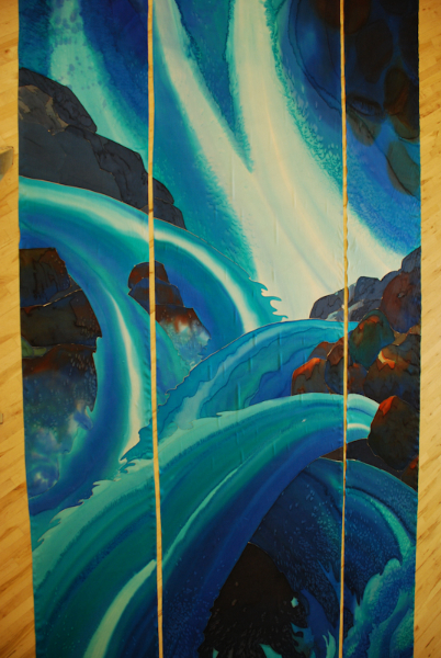
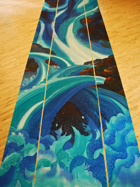
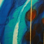
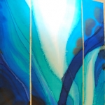
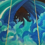
This large 3-panel banner which I call a silk mural, was hung this winter, and really makes a presence as you walk into the sanctuary. It is 36 feet long and 8 feet wide. My task was to design “an abstract waterfall”, leaving room for interpretation.
The wall behind and around this silk mural was painted a medium dark brown to echo some of the rock colors, and to help enhance their videos. Apparently darker colors are better than light ones for this.
This church pushed me in a very positive way, from my comfort level of more representational art to more abstract work. I chose a very limited pallet of blues, with a bit of the complementary dark orange/browns, used value (lights and darks) to drive the design, and really let the silk dye do the work itself instead of controlling it with a lot of detail.
Originally the mural was designed so the cross would hang two-thirds of the way up the banner. This would be on the lower part of the dark stream coming down from the top, and above the white waterfall streams that are hitting the rocks. I hope someday they will do this, but we’ll see. When an artist makes a piece it’s a bit like bringing a child into the world: you have to let go when they leave home.
If you would like to follow the process of designing and making this project, scroll down to see 4 or 5 earlier posts about Zion’s Waterfall. You can see the project morphed quite a bit, before we settled on a final design.
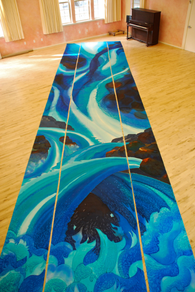
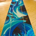
It’s been a very busy summer, but the 36 foot by 8 foot abstract waterfall project is just about finished. This weekend I took the 3 silk panels back to the school gym floor and unrolled them to check finished size and appearance. I am very pleased with the final layers of dye, and think that the goal of a sense of “power” and “mystery” translates very well. I measured everything, and with cutting, rolling, painting, washing, steaming and shrinkage, the panels are very very close to the desired size. The center panel is one inch longer than the other two (difference in shrinkage), and when the panels are side by side with no gap they measure 8 feet by 6 inches exactly, top and bottom, which is what we were shooting for.
The picture below shows the scale of this project, when you see the piano in the upper right hand corner.
I have hemmed the 216 feet of the side edges of the panels, and am about to make the 12 foot slit in the center panel so it can open for the immersion baptismal pool behind the panels. Then I’ll take the 4’x 15″ rectangle out of the top middle of the center panel to make room for the beam in the ceiling, then hem both of those.
Also, all the tops of the silk panels will have sleeves for a rod, to be hung either from the wall or from the underside of the beam. I will lastly put sleeves in the bottom of all the panels in casewe want to run a rod through those too, for stabilizing.
To see full pictures, click on one of the thumbnails below.
The chapel at Artman Senior Home has a bright burgandy carpet and white walls. The paraments that decorate the alter are changed seasonally, with a different color for each season. When I looked at pictures of the chapel with the old banner in place it seemed we could do more to integrate the seasonal colors of red, purple, blue, green, white and gold into the space by designing with a new color scheme to incorporate each seasonal color in a better way than before.
The chapel at Artman Senior Home has a bright burgandy carpet and white walls. The paraments that decorate the alter are changed seasonally, with a different color for each season. When I looked at pictures of the chapel with the old banner in place it seemed we could do more to integrate the seasonal colors of red, purple, blue, green, white and gold into the space by designing with a new color scheme to incorporate each seasonal color in a better way.
Artman Chapel with old banner
I purposely put all the traditional seasonal colors of the Christian church into this design, so that in any season the paraments would find an echo in the banner. Look closely and you will see that green, blue, purple, red, white, and gold are all included in this painting. And of course we could not forget the burgandy of the carpet!
It took me quite a while to figure out how to do this. But I remembered a design I made for a stained glass window, installed in North Seattle, that I had always wanted to re-do in silk. It had a yellow-green base color. Yellow-green is the complementary color to magenta (close to the burgandy color) so I chose to go with that same color scheme: Yellow-green, magenta, gold. and I threw in some cerulean blue for good measure. I think it worked!
Of course I have to give credit to friend and calligrapher Laura Norton, Bellingham WA, for designing the beautiful lettering that I painted on the silk. You can reach her at [email protected].
Working on a project that is 36 feet long when you only see 9 feet at a time can be tricky. I’m working on 3 wooden frames that have rollers on each end, so when I’m done with the first 9 feet I roll the fabric down to the next 9 feet.
Today I got a chance to roll it all out, all three panels side by side, on a big floor at a school so I can see it all at once. This is the only way to check on how it’s going and what changes still need to be made.
Zion’s Waterfall, 36 feet x 8 feet, silk dye on silk, 3/4 finished
It’s hard to get a good picture of something so large. In both of these pictures you can see that the perspective is foreshortened, so it is hard to see the whole thing properly. Even when the panels are hanging vertically on the wall where they belong it will be challenging to get a good photo. Guess you will just have to see it in person!
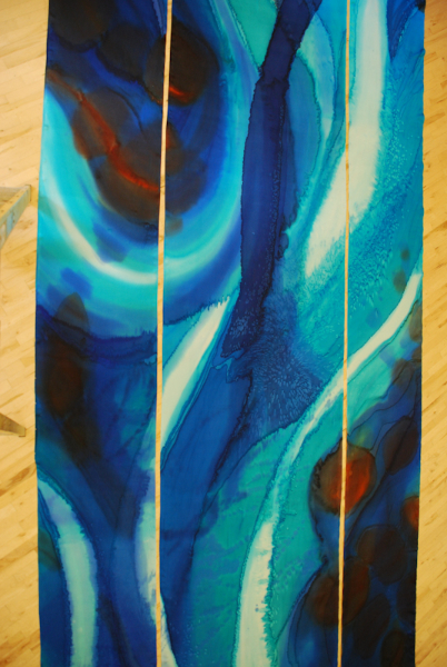
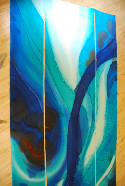
Upside down “Zion’s Waterfall, 36 feet by 8 feet, silk dye on silk, 3/4 finished.
See how different it looks upside down? The white area will be the very top of the painting. The piano is at the bottom of the piece.
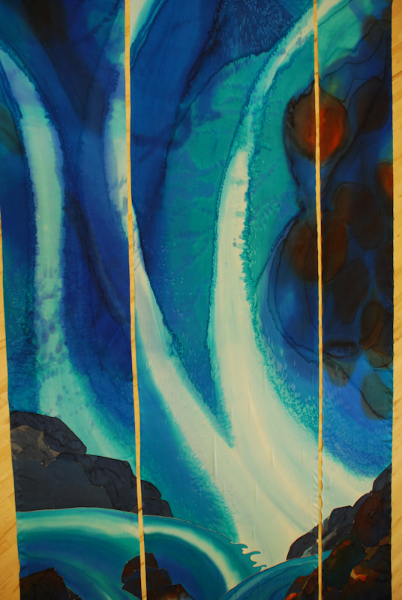
In the next picture you see the very top of the piece, and I’ve selected some shots that take you down the whole length, so as you scroll down you can see some more of the detail. Remember that it’s not finished yet…this view of the whole has left me with a list of things to take care of.
Top of painting
The area in the picture below is where I will be doing the most touch-up work, as far as fixing things go. This area needs some simplification and unification. I have a plan (check back to see how I do this).
Below you can see that the rocks, and the waterfall below the rocks, are the least developed of the project, since I am working from the top down.
Can you see that the colors and textures are not as rich in the lower areas? It’s amazing what just one more layer of dye will do, to add variation and saturation. The rocks will be darker in value, maybe as dark as black, but I want to keep some of the color variation in these rock shapes.
Detail, Zion’s River
And the water in the lower waterfalls will be rich too, with more interesting lines and textures, sort of like what you see below.
I really like making good use of what the dyes can do. It’s a matter of knowing your materials very well, and what happens to them in different circumstances. I’ve used layered dyes to make interesting lines, painted with water to push the paint around, used a watercolor technique of transparency, and blended colors to make soft edges. I’ve used some gutta resist for sharp edges and keeping one section of dye from another, lots of salt, and lots of prayer.
And finally, here I am in my studio-to-be, with the silk on the frames.  Now that all the silk is covered at least once the major decisions are done and the great share of the work is over. Now comes the very most important part of the painting: Tuning it up to make it just right.